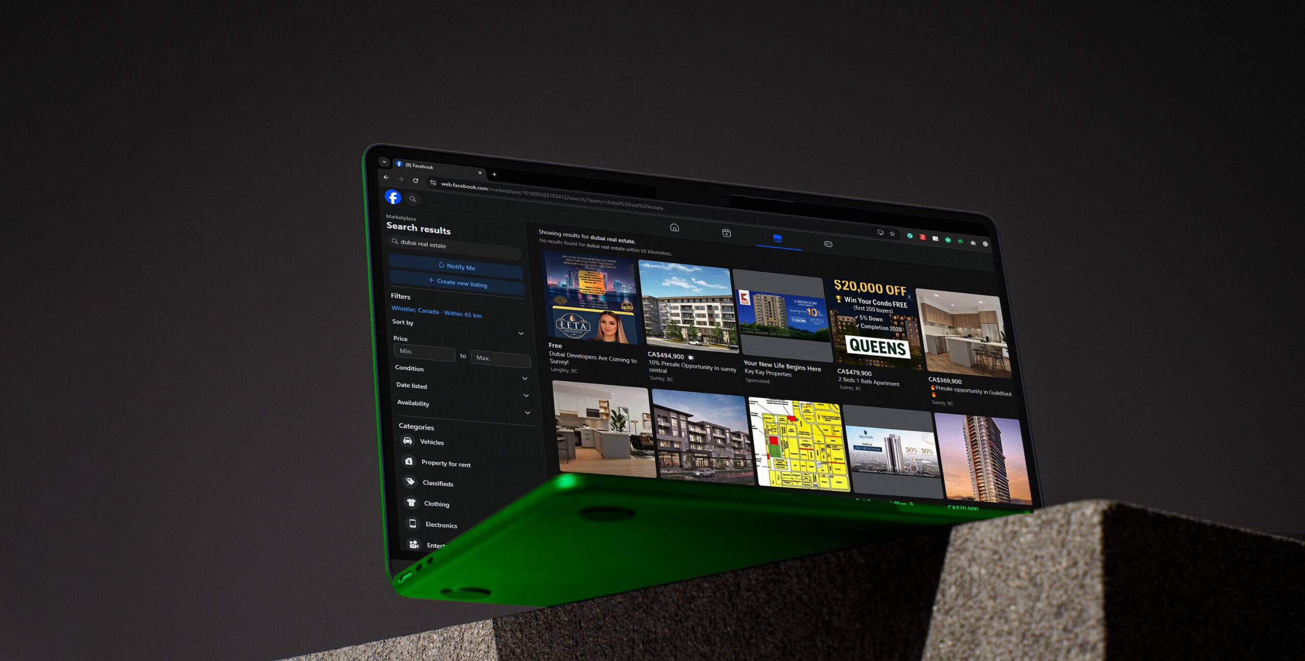
In Dubai’s fast-moving real estate market, a project’s first impression often happens long before the site visit—it begins with branding. Being seen and being remembered is just a matter of the colors, fonts, and visual identity that you use. Good design does not merely draw attention, it creates credibility, conveys worth, and emotional attachments that are long-term between the investors and purchasers.
At Mint and Co., we focus on creating a visual identity that appeals to the varied appeals of the Dubai audience as well as the luxury instinct. Find out how the ideal real estate branding services and strategy in real estate can take your brand above and beyond another name to a market leader.
The Psychology of Brand Colors in Real Estate
Why Colors Matter in the Real Estate Market
Color is more than an aesthetic—it’s a strategy. The human brain processes color faster than text, which means your brand’s colors shape perception before your words do. In the competitive Dubai property scene, color defines positioning: sophistication, innovation, or reliability. For luxury developers, muted golds and deep blues signal prestige; for modern apartment brands, minimalist whites and metallic accents suggest innovation and accessibility.
Common Real Estate Brand Colors and Their Meanings
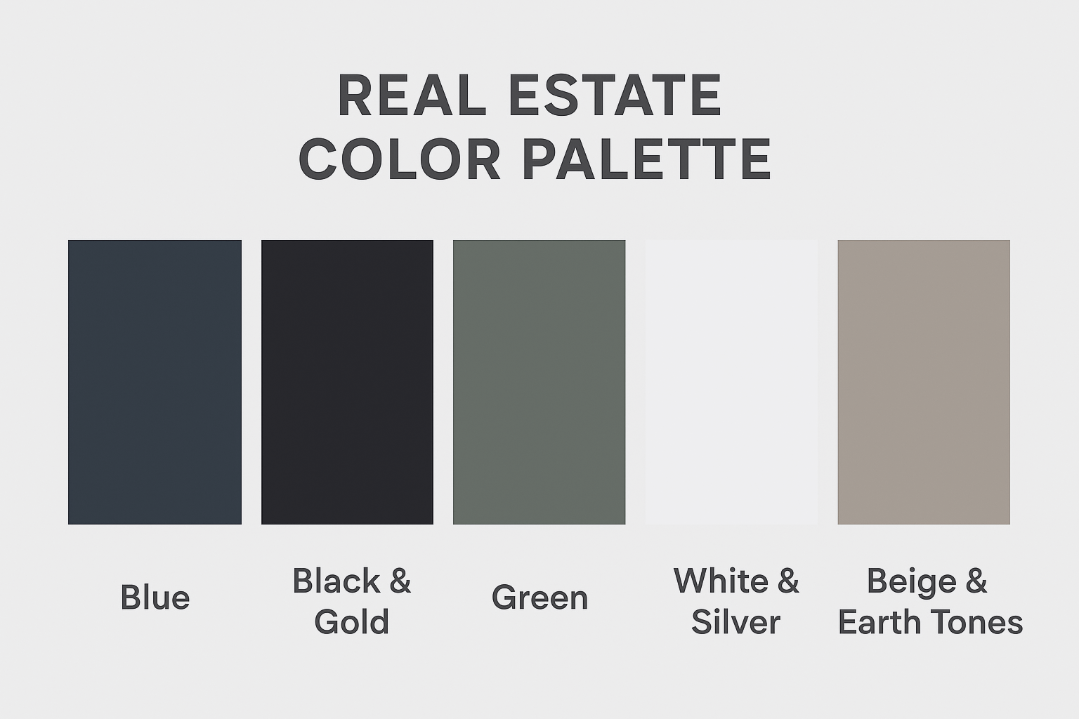
- Blue – Trust, security, and professionalism. A popular choice among real estate agencies for its corporate appeal.
- Black & Gold – Luxury and exclusivity. Perfect for high-end real estate branding targeting premium investors.
- Green – Growth, sustainability, and balance. Ideal for eco-conscious or suburban developments.
- White & Silver – Minimalism and modernity, reflecting clean architecture and progressive living.
Beige & Earth Tones – Warmth and approachability, often used by community developers and family housing projects.
Each hue tells a story—and the right story aligns with your audience’s aspirations and lifestyle goals.
Choosing Your Brand Colors for Different Audiences
The Dubai real estate market has several types of buyers: local buyers, foreign investors, and expats who will want to stay in Dubai. Color psychology has different reactions to different audiences.
- In the case of luxury investors, strong contrasts and metal finishes will provide exclusivity.
- New customers can enjoy new calming colours such as whites, blues and gentle neutrals that bring in comfort and confidence.
- In the case of commercial brands, sharp and monochromatic colors suggest professionalism and power.
The Role of Fonts in Real Estate Branding
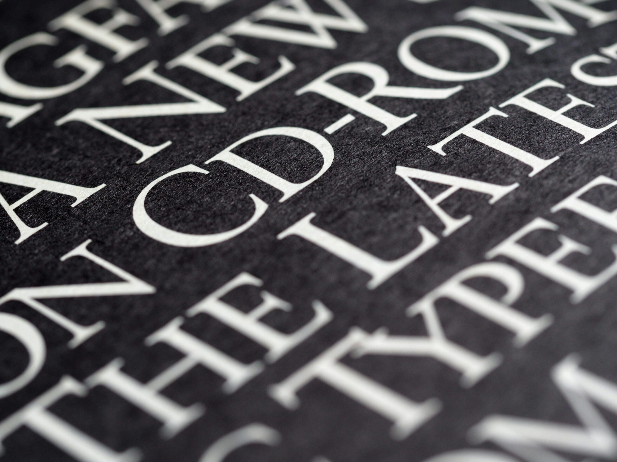
Importance of Typography in Brand Perception
Typography speaks as loudly as your visuals. The tone, legibility, and even the emotion is determined by the right font. Often, the typography of real estate branding must be elegant and at the same time clear-cut- each letter must convey the promise of your brand. The fonts could be serif, which tend to convey the themes of elegance and tradition, or it could be the sans-serif fonts, which could be interpreted as a symbol of modernity and efficiency.
For example:
- Serif fonts such as Playfair Display or Lora are also the best ones to use in luxurious real estate.
- The tech-neutral, minimalist property brands would suit sans-serif fonts (e.g. Montserrat or Poppins).
- Bespoke typography has the potential to boost the personality of a developer and make even initials identifiable brand symbols.
Recommended Fonts for Dubai Real Estate Brands
Dubai’s multicultural audience appreciates clarity and elegance. Your branding fonts should be legible across Arabic and English designs while maintaining brand harmony. Recommended combinations include:
- Lato + Playfair Display: A blend of modern and timeless appeal.
- Poppins + Lora: Clean and approachable, great for real estate agencies.
- Roboto + Cormorant Garamond: Professional yet refined, ideal for corporate real estate brands.
Remember: Consistency is key—using too many fonts can confuse your audience and weaken recognition.
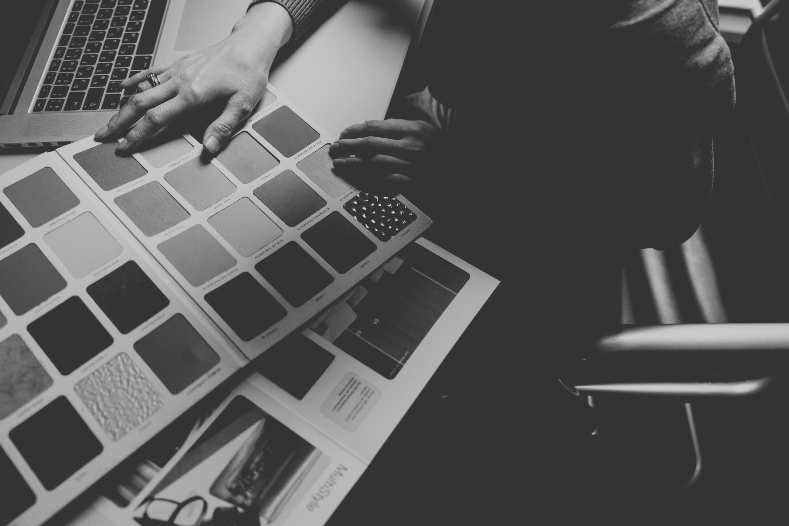
Practical Guidelines for Implementing Colors and Fonts Consistently

A brand book is your design bible. It also makes sure that all marketing touchpoints such as brochures and hoardings, are done in the same way as far as visuals are concerned. This is a consistency that creates recognition and trust particularly in a saturated market like that one of Dubai. Include:
- Your color palette with HEX/RGB codes
- Primary and secondary fonts with size hierarchy
- Logo usage guidelines
- Image tone and style references
Using Colors and Fonts on Digital and Offline Platforms
Your graphics must be smooth and seamless in all media.
- Digital Platforms: Use clean fonts for legibility and colors that pop on mobile screens.
- Offline Marketing: Choose tones that maintain visibility in outdoor light (especially for OOH advertising).
- CGI and Render Visuals: Ensure your brand palette enhances—not clashes—with architectural imagery.
This alignment between print, web, and 3D ensures your brand looks cohesive, no matter where it appears.
How Mint & Co. Can Help Build Your Real Estate Brand in Dubai
At Mint & Co., we do not simply create logos, we create legacies. We are a creative process that combines the science of psychology, strategy and precision of design to create strong emotionally provoking real estate brands. It starts with determining your core color story to your choice of signature typography, we make sure that every detail tells who you are in the market.
Whether you’re rebranding an established developer or launching a new off-plan project, our branding experts build visuals that stand tall in the skyline—and in people’s minds.
Conclusion
Got Questions? We’ve Got You.
There’s no one-size-fits-all. For luxury real estate, black and gold exude prestige. For community housing, blues and neutrals foster trust and warmth. It depends on your audience and positioning.
Emotion is linked to color theory. Examples include blues as a building of trust, greens as a symbol of growth, and gold as a sign of luxury, which are all employed in relation to the brand message.
Mint & Co. creates bespoke real estate branding strategies—from visual identity and CGI to content and PR—helping developers establish distinct, recognizable brands that stand out in Dubai’s luxury property market.